
Apple Home, Simplified
Challenge
Users struggled to quickly control their smart homes as the Apple Home app grew increasingly complex with more devices and features.
Concept
We simplified the Home app by organizing devices around how people actually use their homes, pairing clear copy with streamlined visuals.
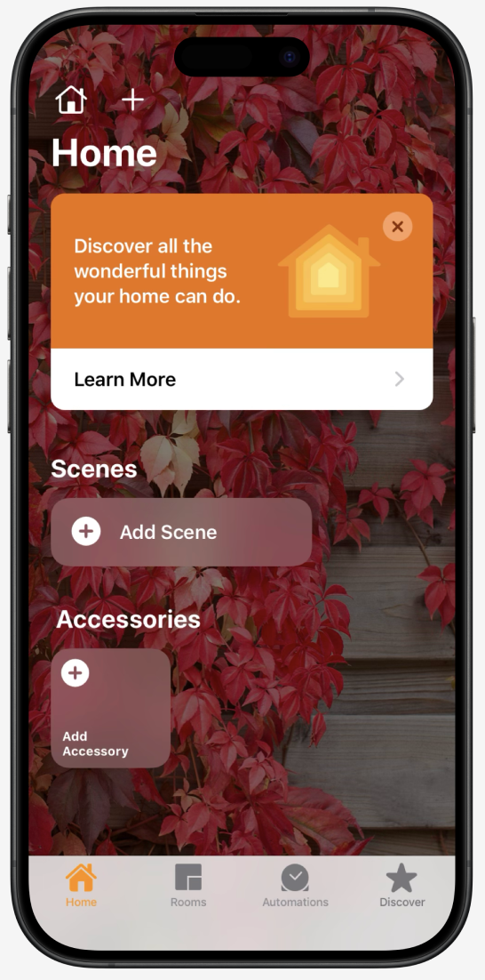
At a Glance
The redesigned Home screen now provides instant clarity. Users see capabilities and take action without digging through device lists or menus.
My Role
I wrote UX copy and product messaging that translated technical smart home features into clear, real-world scenarios users could easily understand.
Stories That Make Sense
Discover organizes educational content by smart home needs—lighting, comfort, security—using real scenarios to make features approachable.
Global Collaboration
Writing for a global, preinstalled app meant working closely with localization teams to ensure copy stayed clear, approachable, and true to Apple's voice across cultures.
Impact
The redesign transformed a fragmented smart home experience into an approachable one. Clear onboarding gave users a simpler path to explore features, add devices, and build confidence.